
Understanding Your Dashboard
A tour of every panel on your Topple dashboard — what each one shows and where to go for more detail.
Last updated September 1, 2026
Top Panel
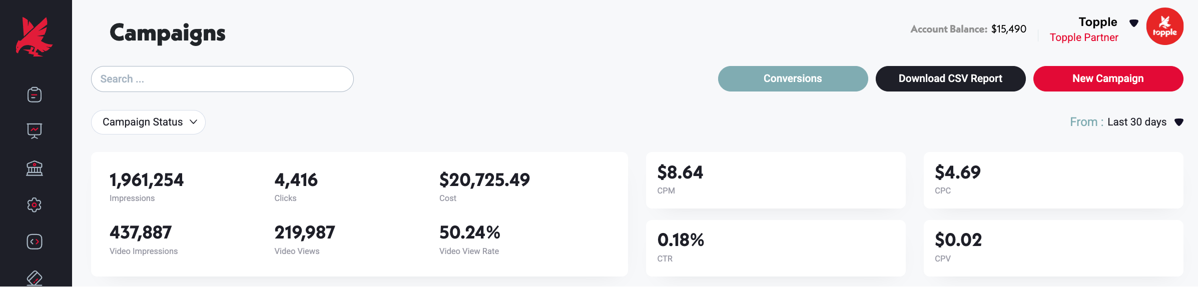
At the top of your dashboard you will find your Account Balance — the amount of money you have funded which has not yet been spent on campaigns. Next to it is your user-profile menu, which links to Billing, Notifications, and Password & Security settings.
Account Performance Overview
Below the top panel, the Account Performance Overview aggregates data across all of your campaigns for a selected time period. Use the date range picker in the top-right corner to narrow or widen the window. The metrics shown here — Cost, Impressions, Clicks, and Conversions — are totals across every campaign in your account.
Statistics Graph
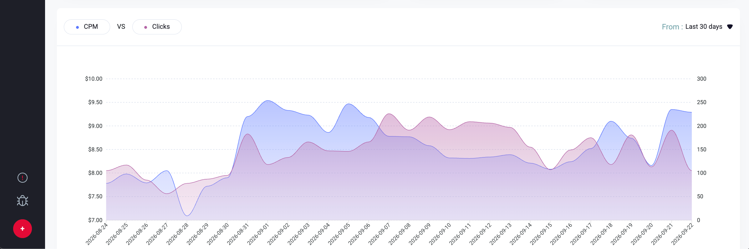
The Statistics Graph lets you compare two metrics side-by-side over a custom date range. Select any two of the following: Cost, Clicks, CPC, CPM, Impressions, Video Impressions, Views, CPV, VTR. The graph plots both over time so you can spot trends and correlations. Use the Download CSV Report button below the graph to export the data.
Campaign Chart
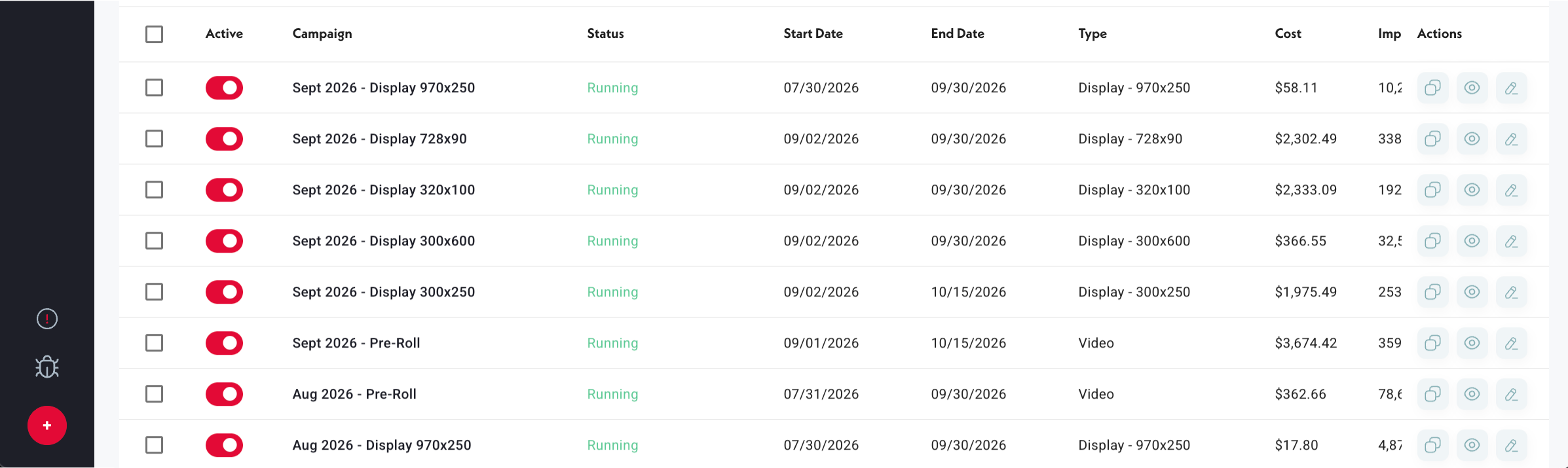
The Campaign Chart lists every campaign in your account — active and inactive. Each row shows: Start/End Date, Cost, Impressions, Clicks, CPM, CPC, CTR, Conversions, Video Views, and Status. From the far-right column you can Preview, Edit, or Delete a campaign.
Reporting Tabs
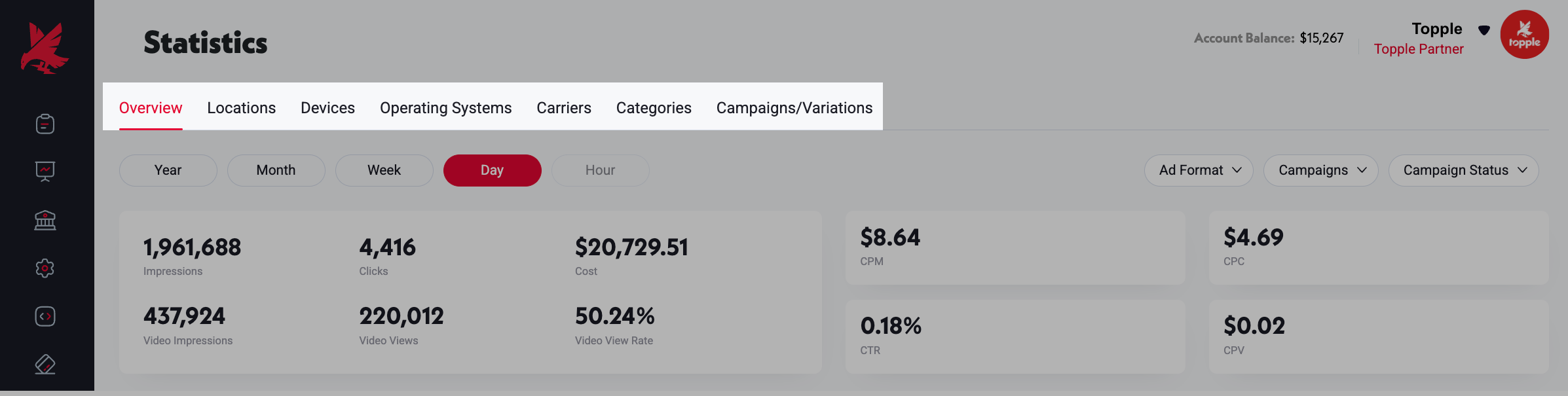
Below the Campaign Chart are six tabs that break performance down further: Locations (a heatmap of where impressions and clicks are coming from), Devices, Operating Systems, Carriers, Interest Categories, and Variations (creative-level performance). Each tab is described in detail in the Reporting category.
Was this helpful?